
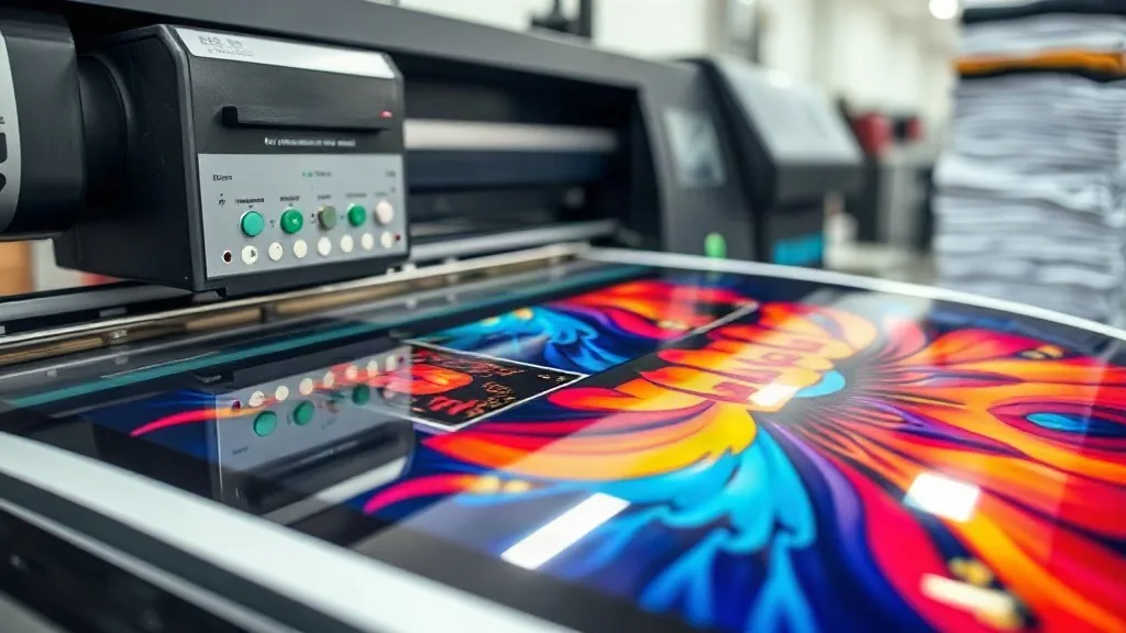
You've dialed in your press settings, your powder application is flawless, and your film choice is spot-on, yet your DTF transfers still look a little... off. The reds are more brick than fire engine, and that vibrant teal from the design file prints as a muted blue-grey. If this sounds familiar, you're not alone. Color inconsistency is one of the most frustrating and overlooked challenges in DTF printing, and it rarely has anything to do with your heat press.
In this guide, we're going beyond the basics of pressing and powdering to tackle the root cause: color management. We'll walk through the practical steps to get your printer, your software, and your materials all speaking the same color language. By the end, you'll have a repeatable system for producing dtf transfers that match your client's expectations and your own high standards, every single time.
Why Color Management Is the Missing Link in DTF
DTF printing is a bit of a wild west when it comes to color. Unlike other printing methods, you're not just dealing with ink on paper. You're dealing with liquid pigments that are printed onto a film, dusted with adhesive powder, melted, and then heat-pressed onto a fabric. Each of these steps can shift the final color, and if you're not controlling the variables, you're essentially guessing.
The biggest culprit is the printer itself. Out of the box, most DTF printers are not calibrated for accurate color. They're set up to produce pleasing, saturated images, not necessarily accurate ones. Add to that the fact that different RIP software (the software that translates your design into printer commands) interprets color data differently, and you have a recipe for inconsistency. The key is to take control of the entire workflow, from design file to finished garment.
The Difference Between RGB and CMYK (and Why It Matters)
Your monitor displays colors in RGB (Red, Green, Blue), which has a wide gamut and can show incredibly vibrant, almost neon colors. Your DTF printer, however, uses CMYK (Cyan, Magenta, Yellow, Black) inks, which have a much narrower gamut. When you send an RGB file to your printer, the RIP software has to convert those colors into CMYK, and some colors simply can't be reproduced. That's why the neon green in your design might print as a dull olive.
To avoid disappointment, it's crucial to design in CMYK or at least soft-proof your RGB designs using a CMYK profile. This way, you'll see on your screen what the printer can actually produce. It's a tough pill to swallow for designers used to the full RGB spectrum, but it's the first step toward predictable results.
Step-by-Step Color Calibration for Your DTF Printer
Calibration is the process of aligning your printer's output with a known standard. It might sound technical, but it's a straightforward process that pays for itself in reduced waste and happier customers. Here's how to do it.
1. Start with a Clean Printer
Before you calibrate, ensure your printhead is clean and your ink lines are free of air bubbles. A clogged nozzle or a misfiring printhead will throw off your color readings. Run a nozzle check and a head cleaning cycle if needed. Also, make sure your ink cartridges are sufficiently full and are from a reputable supplier. Cheap third-party inks can have inconsistent color properties, making calibration a moving target.
2. Choose the Right ICC Profile
An ICC profile is a file that describes the color characteristics of your printer, ink, and media combination. Your printer manufacturer or RIP software vendor likely provides profiles for common DTF films. Start with the profile recommended for your specific film and ink set. If you're using a third-party film, check the manufacturer's website for profiles. Installing the correct profile in your RIP software is essential; it tells the software how to convert colors to get the best possible output.
3. Print and Measure a Color Target
To truly calibrate, you need to measure actual printed colors. You can use a spectrophotometer, but for most small shops, a simpler approach works: print a standard color target (like the IT8.7/4 or a custom target from your RIP software) and visually compare it to a reference. If you don't have a measurement device, you can still do a visual calibration by printing a test image with known colors (skin tones, sky blues, neutral greys) and adjusting your printer's color settings in the RIP until the output looks neutral and accurate.
4. Adjust Ink Limits and Linearization
In your RIP software, you'll find settings for ink limits and linearization. Ink limits control the maximum amount of ink laid down, preventing bleeding and ensuring proper curing. Linearization adjusts the ink curve so that a 50% color value in your file prints as a 50% density on the film. These settings are usually part of the profile, but if you're creating a custom profile, you'll need to adjust them. For most users, sticking with a well-made profile is sufficient.
5. Consistent Viewing Conditions
Color is subjective and influenced by lighting. When evaluating your prints, use a standardized viewing booth or at least a consistent light source (like a D50 or D65 bulb) that mimics daylight. Avoid judging color under mixed lighting or fluorescent shop lights, which can make colors appear warmer or cooler than they are. This consistency is key when comparing your print to a client's reference or a Pantone chip.
Common Color Issues and How to Fix Them
Even with calibration, you might encounter specific color problems. Here's a troubleshooting guide for the most frequent complaints.
- Prints look dull or washed out: This is often due to insufficient ink coverage or a wrong ICC profile. Check that you're using the correct profile for your film and that your ink limits aren't set too low. Also, ensure your film is not expired and is stored properly.
- Colors are too dark or muddy: This could be a sign of over-inking. Reduce ink limits or check that your linearization is correct. Additionally, too much powder can darken prints, so ensure you're applying a thin, even coat.
- Red turns brown or orange: This is a common issue with CMYK printing because red is created by mixing magenta and yellow. If the mix is off, red can shift. Try adjusting the magenta and yellow curves slightly in your RIP or use a different profile. Sometimes, a small tweak in the design file (like increasing magenta by 5%) can help.
- Blacks are not deep enough: DTF printers often use a composite black (mixing CMY) which can look washed out. If your printer supports a dedicated black ink or a light black, use it. Otherwise, ensure your black areas are printed with sufficient ink density and consider using a rich black (adding some cyan and magenta) in your design file.
Choosing Materials That Support Color Accuracy
Your film and powder play a significant role in final color. Not all DTF films are created equal. A high-quality film will have a consistent coating that accepts ink evenly and releases it cleanly during pressing. Cheap films can cause ink to pool or not adhere properly, leading to color shifts and inconsistencies. Similarly, the adhesive powder can affect the final appearance: a very fine powder might produce a softer hand but can also mute colors slightly, while a coarser powder might give a more vibrant but thicker feel.
When you're searching for reliable supplies, it's worth testing a few different brands to see which ones give you the most consistent results. If you're looking for dtf transfers near me, you might also consider local suppliers who can provide personalized advice and faster turnaround. Building a relationship with a supplier who understands your equipment and workflow can be invaluable.
Workflow Tips for Consistent Color Every Time
Beyond calibration, establishing a consistent workflow is crucial. Here are some habits to adopt:
- Standardize your design files: Ask clients to provide files in CMYK or at least provide a CMYK proof for approval. Use a consistent color profile (like Adobe RGB or sRGB) for all your designs and convert to CMYK at the end.
- Keep a print log: Record the settings used for each job (profile, ink limits, temperature, pressure, powder type) and note the results. This helps you replicate success and troubleshoot issues.
- Regular maintenance: Clean your printhead regularly, check for clogs, and replace dampers and wipers as needed. A well-maintained printer produces consistent color.
- Batch similar jobs: If you have multiple jobs with similar color palettes, print them together to minimize color variation between runs.
Mastering color management in dtf printing is a journey, but it's one that separates hobbyists from professionals. By taking control of your color workflow, you'll reduce waste, save time, and build a reputation for quality that keeps clients coming back.
Frequently Asked Questions
How often should I calibrate my DTF printer?
For most small shops, a full calibration with a color target is recommended every 3-6 months, or whenever you change ink brands, film types, or notice a significant shift in output. However, a quick visual check with a test print should be done weekly to catch any drift early.
Can I use a regular inkjet printer for DTF transfers?
No, DTF requires a printer with DTF-specific inks (usually pigment-based) and a white ink channel. Regular inkjet printers use dye-based inks that won't adhere to fabric and lack the white ink needed for opacity on dark garments. Converting a regular printer is possible but requires significant modification and is not recommended for beginners.
Why do my DTF transfers look different on different fabrics?
The fabric color and texture can affect the final appearance. Printing on a dark fabric will require a thicker white ink layer, which can slightly alter the perceived color. Additionally, fabrics with a lot of texture (like ribbed knits) can cause the ink to settle differently. Always test on the actual fabric you'll be using.
What is the best way to store DTF transfers to maintain color?
Store unused transfers in a cool, dry place away from direct sunlight. Heat and humidity can cause the powder to absorb moisture and the ink to degrade. Keep them in a sealed bag or container. Properly stored transfers can last for several months without significant color loss.
Do I need a spectrophotometer for color management?
Not necessarily. While a spectrophotometer provides precise measurements, you can achieve good results with visual calibration and using manufacturer-provided ICC profiles. However, if you demand the highest level of accuracy and consistency, investing in a spectrophotometer and learning to create custom profiles is a worthwhile step.